As designers, we have grown to understand the significant role color plays in the world of interiors. Our focus goes beyond making a space aesthetically pleasing- it’s about creating an environment that is conducive to the emotions and feelings you want to evoke. Making the right choices for your home’s interior color scheme could be as easy as understanding color psychology. Throughout this article, we will discuss some tips for selecting your home’s color palette, as well as the universal associations that different colors can have.
Lead with Purpose
Choosing the right scheme for your space is not as simple as it may seem. There are a few factors to consider before making your final decisions. The first step is to determine the functional purpose and intended emotional impact of the space. Are you looking to create a calming oasis in your bathroom or a lively and inspiring study? Once you have a clear understanding of the desired ambiance, you can start to narrow down your color choices.
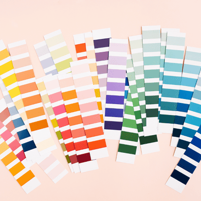
Hues, Shades, Undertones
Generally, cool hues like blues and greens evoke a sense of tranquility, while warmer ones such as reds and oranges infuse the space with an energetic burst. However, there are always exceptions to the rule, especially when you take into account the many shades. For example, deep purples have the capability of soothing and giving a sophisticated impression, whereas bright purples have the opposite effect, with a rather whimsical allure.
In addition to the color itself, the color’s undertone also plays a role in how it will affect your space. This can be harder to identify, but it can make a big difference in how the color will work with your other materials and finishes. For instance, blue paint with a green undertone can give the space a serene quality, while a blue with a purple undertone can add depth and richness. Typically, we recommend placing a sample of a potential shade in the desired space for a full day to observe how the color changes under natural light.
Cohesive Vision
The final step is to select a color palette that complements the existing fixed elements in your space. Consider the flooring, countertops, and other finishes when making your selections. You want the overall space to feel cohesive, not like a jumble of various elements.
Color Guide
Now that you have some factors to consider when choosing colors for your space, let’s take a look at color associations and interior applications of different hues.
White: Purity, Cleanliness, and Neutrality
There are seemingly endless possibilities for the use of white in your home. We like to think of this hue as an interior designer’s canvas, a neutral that provides an air of refinement, versatility, and timelessness to a space–commonly used in kitchens and baths.
Gray: Sophistication, Stability, and Calm
While gray may be seen as a dull and boring color by some, it has the potential to be incredibly chic and sophisticated. In spaces like bedrooms and bathrooms where you want to create a serene atmosphere, gray helps to do so by adding a sense of stability and peace. It is a versatile color that does not run the risk of being too stark, and it has a little more depth than a simple black color.
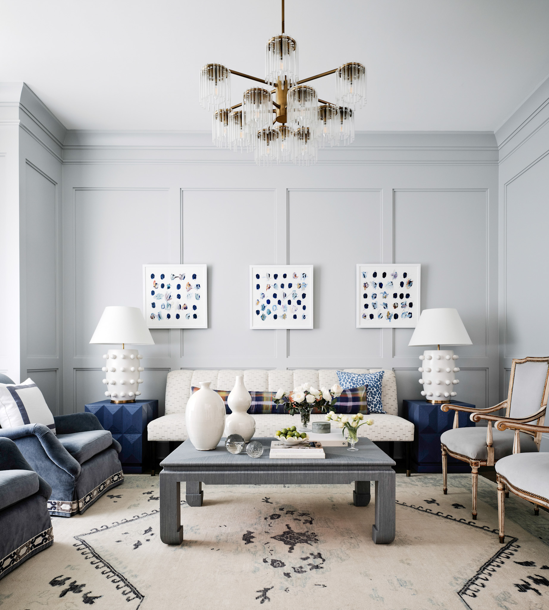
Blue: Balance, Tranquility, and Intellect
Out of all the hues in the color wheel, blue is often cited as being the most popular. It’s not hard to see why; blue has a calming effect that can help to create a feeling of balance and tranquility. It is because of this reason that blue is often found in living rooms and parlors. Additionally, blue can anchor a space’s design when combined with complementary colors.
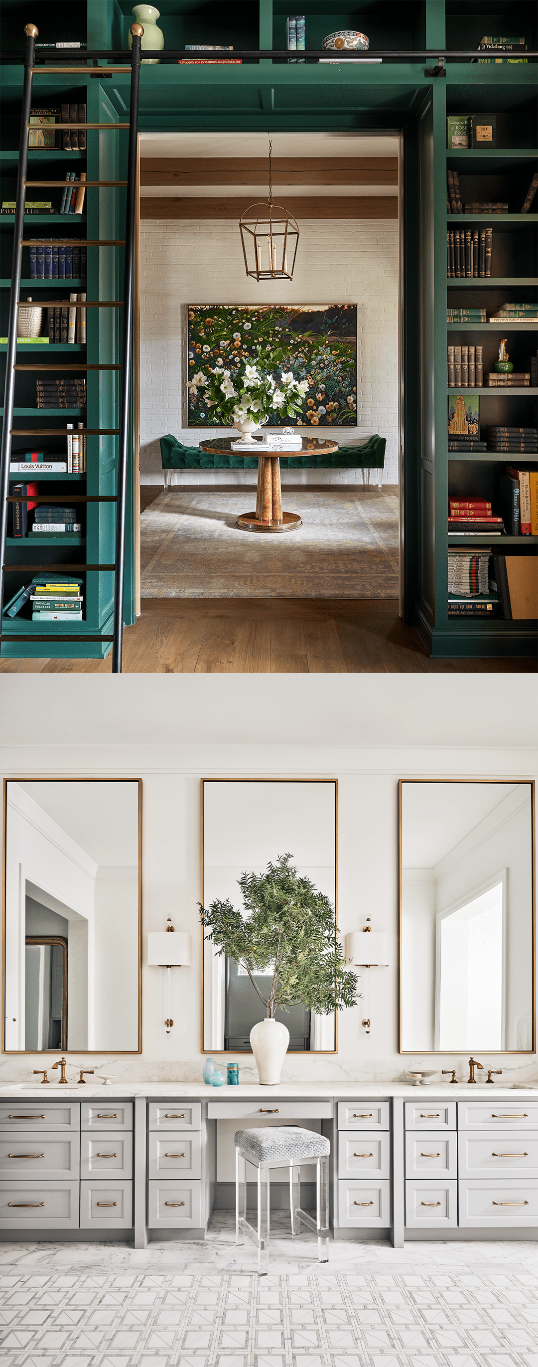
Green: Growth, Vitality, and Renewal
It’s no wonder that green is often used in interior design; this vibrant hue has a way of captivating the eye and lending a feeling of freshness to any setting. Whether it’s in the form of a potted plant or a statement piece of green furniture, this color can help to create a feeling of growth and vitality. And when it comes to choosing the right green for your space, there are endless possibilities. From rich emerald to airy sage, there’s a shade of green to suit every taste.
Yellow: Happiness, Optimism, and Creativity
When it comes to creating a happy and inviting space, yellow is the perfect color. It is associated with happiness and optimism, making it ideal for rooms where you want to encourage creativity. Whether you’re painting a home office or designing a playroom, yellow can help to create a warm and inviting space. When using yellow in your home, be sure to pair it with other colors that complement its cheerful tone. Bright white, light green, and pale pink are all great options. With its ability to brighten any space, yellow is the perfect color for adding a touch of sunshine to your home.
Red: Energy, Excitement, and Passion
The color red is often associated with passion and energy, which makes it the perfect choice for spaces that need a sense of excitement. Red also has the ability to evoke strong emotions, and it can be used to create a powerful ambiance. When used in moderation, red can be a very effective way to add drama and interest to a space. However, it is important to remember that too much red can be overwhelming, so it is important to use it sparingly and methodically.
Orange: Joy, Enthusiasm, and Vitality
Of all the colors in the spectrum, orange is perhaps the most polarizing. Some people love its vibrancy and energy, while others find it overwhelming and garish. However, there’s no denying that orange is a color with a lot of personality. When used judiciously, it can add a sense of joy and enthusiasm to any space. But orange isn’t just for high-energy spaces. When paired with calming colors like blue or green, it can actually be quite soothing. So whether you want to create a lively atmosphere or a tranquil oasis, don’t be afraid to experiment with this versatile color.
Purple: Creativity, Luxury, and Sophistication
Purple has long been associated with luxury and sophistication. It is commonly used in interior design to create a feeling of opulence and refinement. With its association with art and literature, purple is also a color of creativity and imagination. Whether you’re looking to add a touch of luxury to your home or simply want to express your creative side, pops of purple may be a great option.
The next time you’re considering a paint job or just want to freshen up a room with new colorful decor, keep in mind the psychological associations of different colors and how they can be used to create specific moods. With this knowledge, you can take your home’s interior to the next level and select a color palette that will make a lasting impression on you and your guests.